Brief
Design a composition of stylized urban and architectural elements set
inside the main letter (or a middle letter) of a chosen city's name.
The buildings and landmarks must be emblematic and recognizable for
the chosen city.
This brief was inspired by Jack Daly's
illustration project and assigned by SoftUni as the final project for
the Illustrator advanced 2022 course.
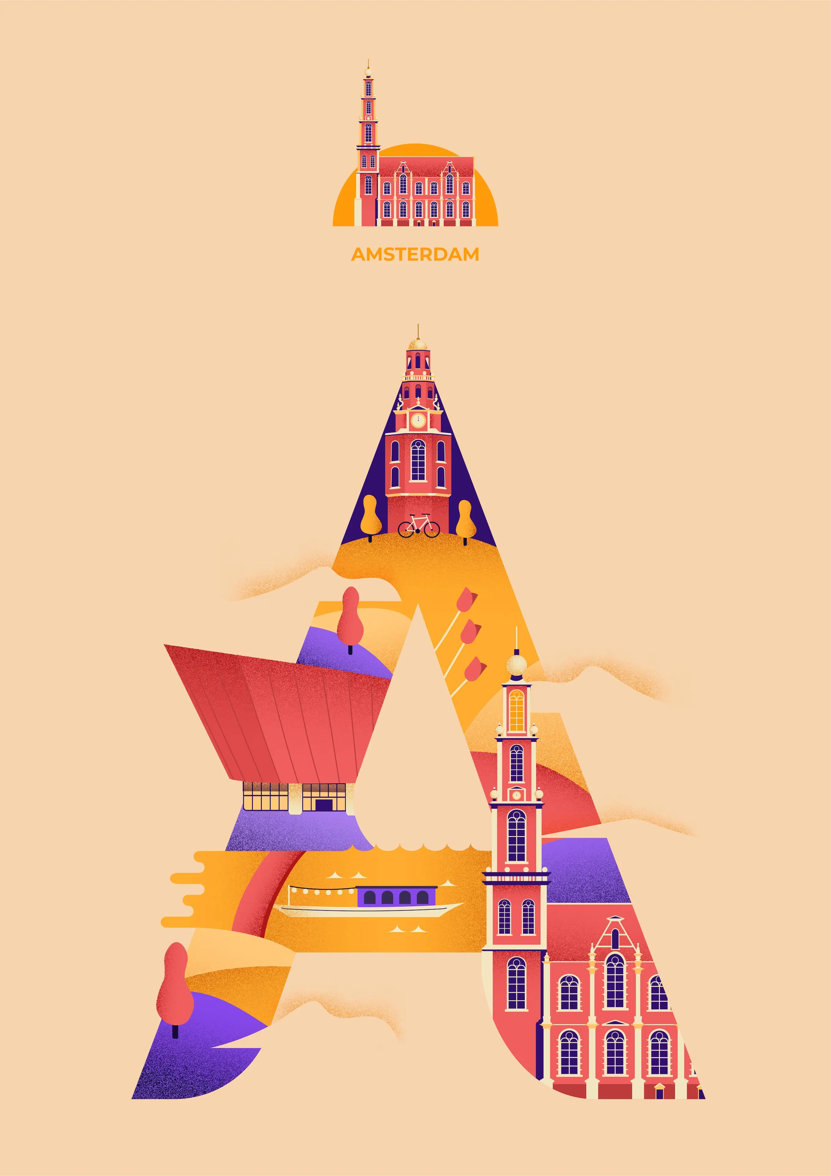
A for Amsterdam
About the illustration
I decided to go with Amsterdam, a city I feel drawn to but have never visited. Inside the letter I placed the Montelbaanstoren clock tower at the top, the NEMO Science Museum in the middle left, and the Westerkerk church on the bottom right as my three landmarks. I chose the tower and church for their architecture and the museum for its distinctive shape and position. I also sprinkled in some details that the Netherlands is known for: the bike at the base of the clock tower, the tulips that sit above the church, and the canal boat just below the museum.