Quake Energy
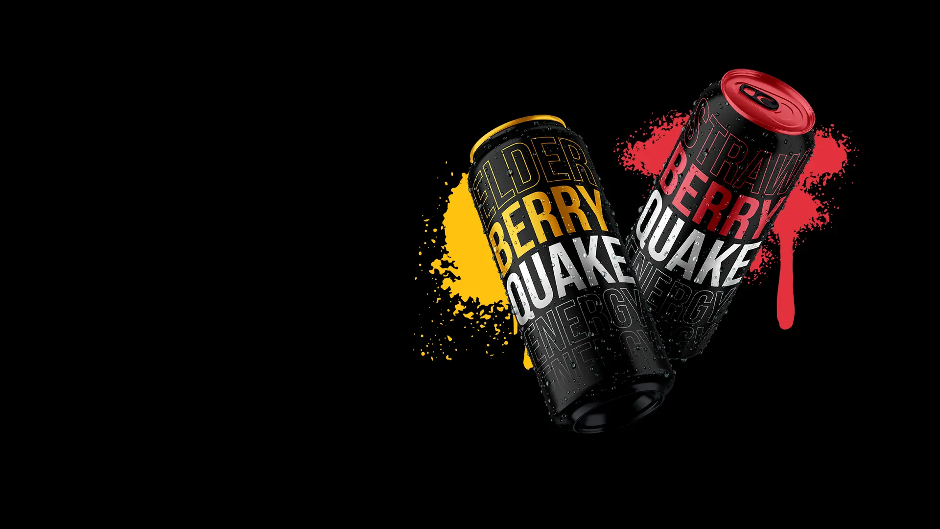
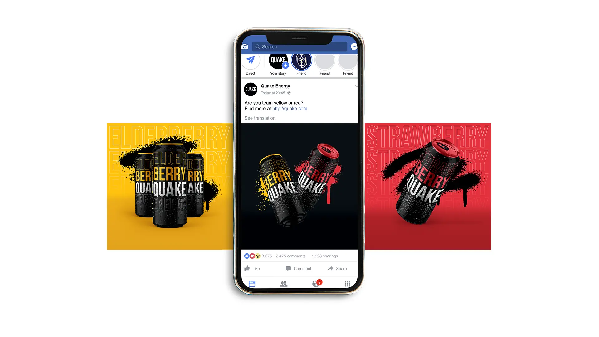
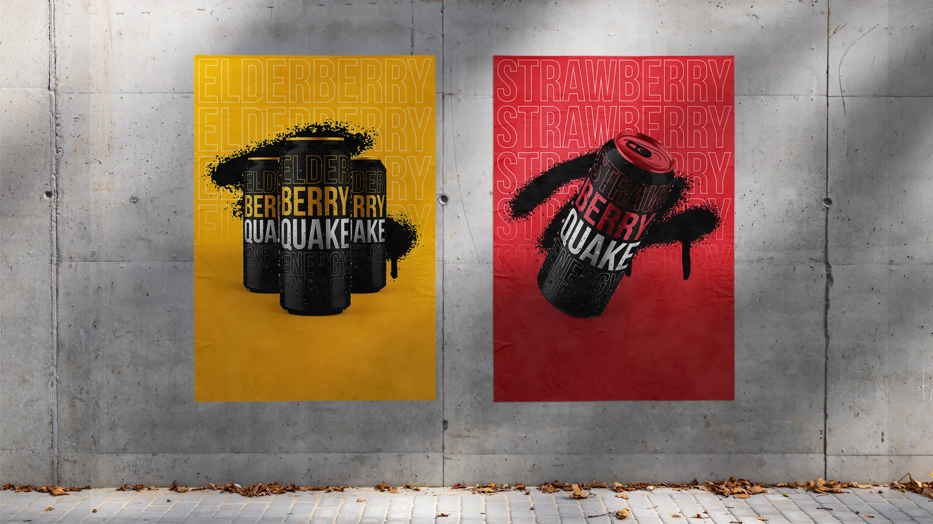
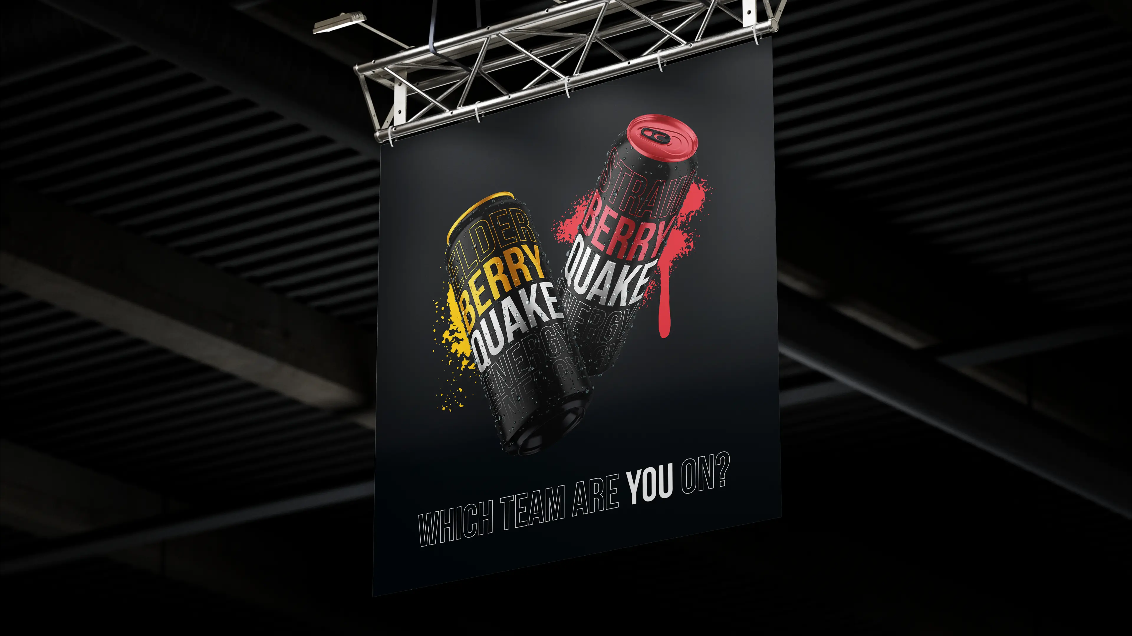
Quake is an energy drink company, starting off with their signature flavors: strawberry and elderberry. Their strong fruity flavors, bold and unique identity, as well as their high-quality recipe make them stand out from their competitors.
Objective
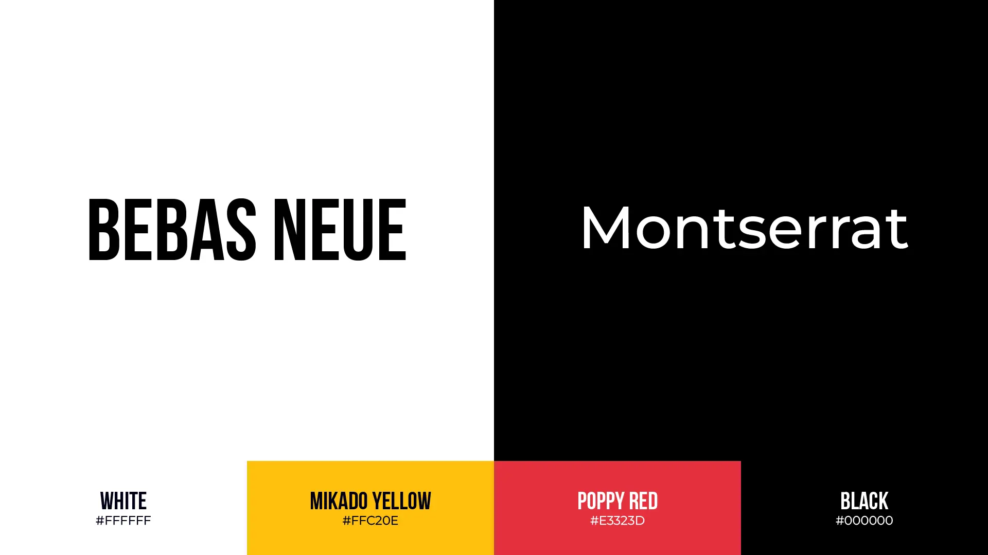
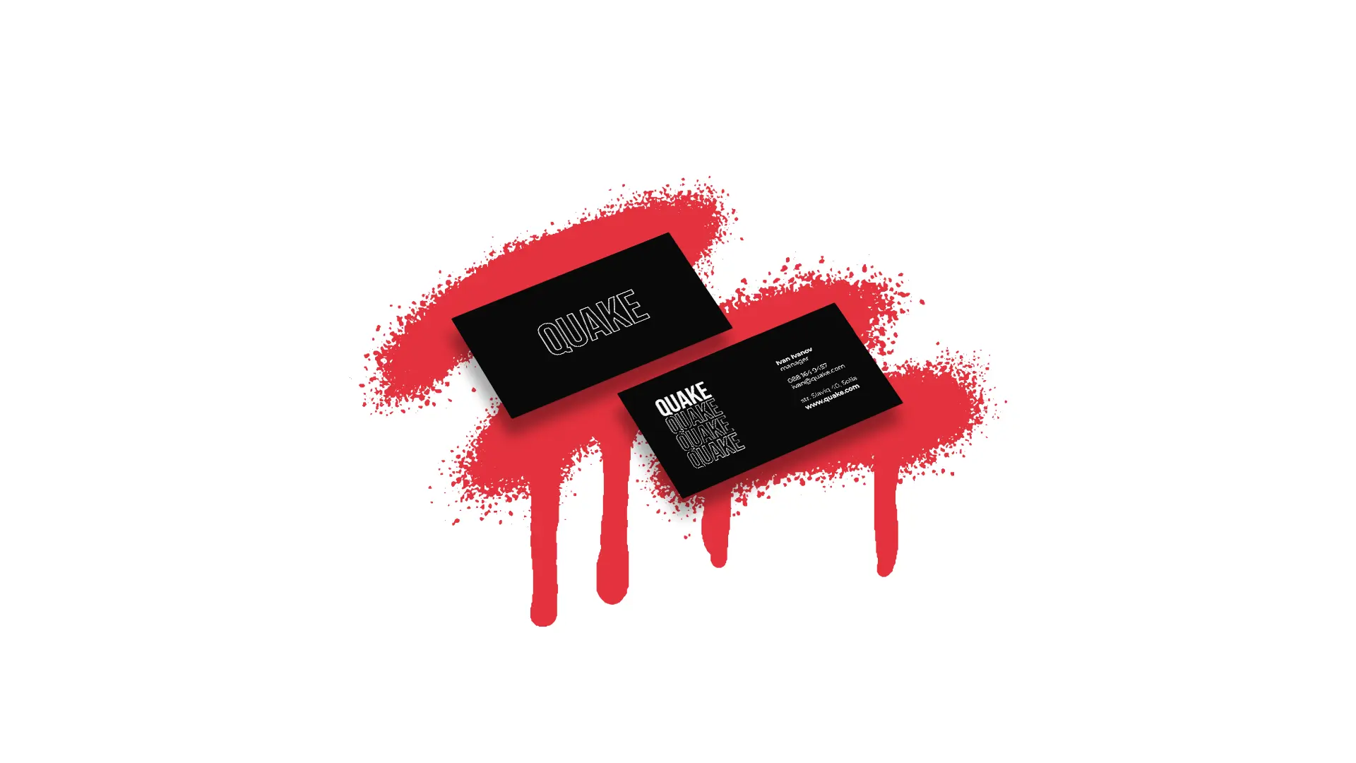
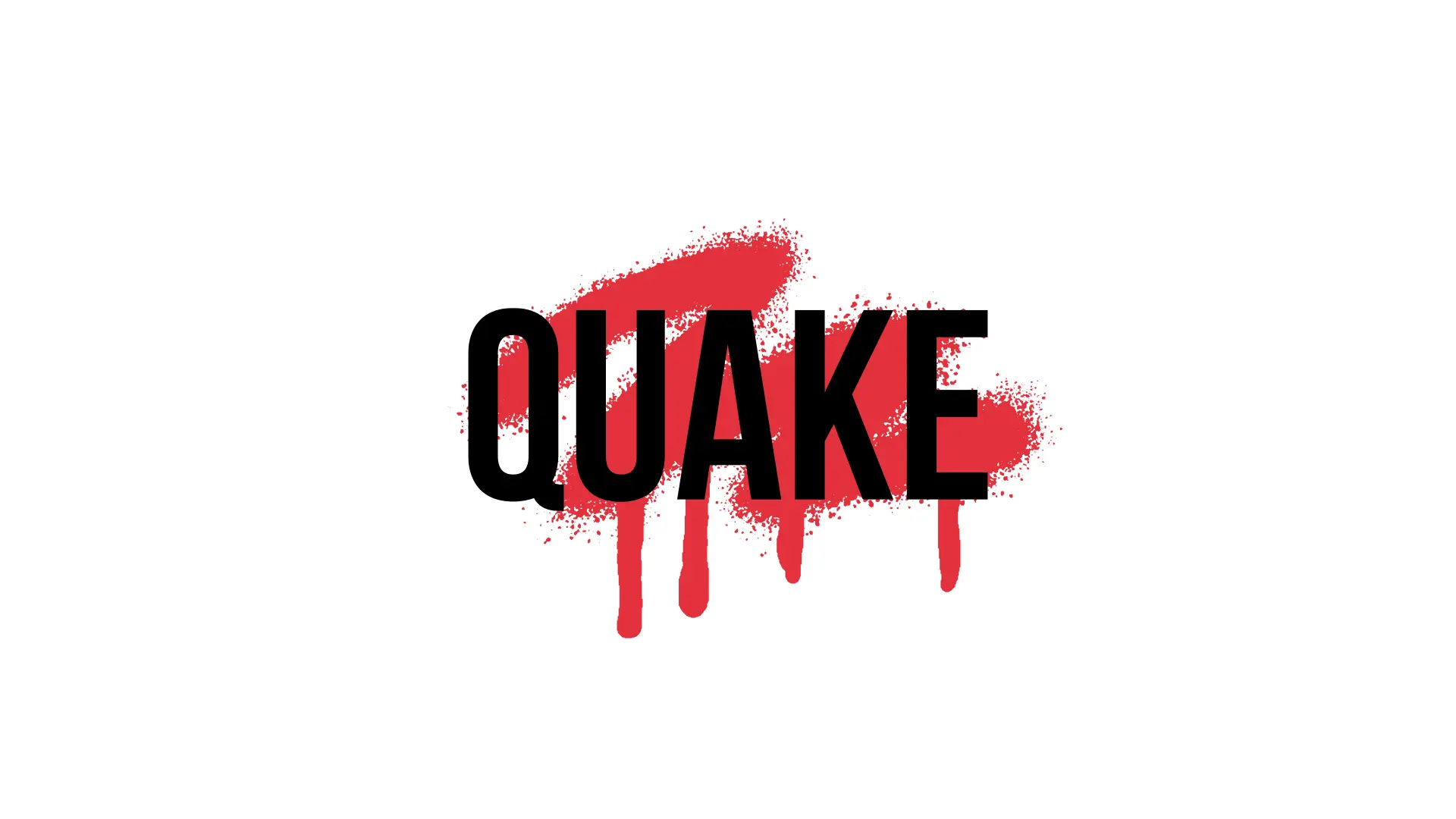
The goal was to create a visual identity along with print and online materials that were bold, brave, and most importantly, typography-centered.
Challenge
Align the brand's visual identity with a style most common in streetwear: street.
Solution
Design bold, typography-centered print and packaging materials accompanied by a single accent color to fit the desired feel.